A plate of food served for dinner at a restaurant is often sourced from an array of distant locations. The potatoes were grown in Idaho, the carrots were produced in California, the wine was distilled in Oregon, and the beef was sourced from Oklahoma from cattle that were fed corn which was cultivated in Iowa.
The American food supply chain relies on a vast and complex web of suppliers distributing their products across the nation. Urban and rural areas alike are interwoven in this economic network of food production, processing, storage, and distribution. This post is derived from a study done by Associate Prof. Megan Konar chronicling the food flows between all counties in the United States.
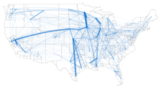
American Food Flows by State
American Food Flows by County
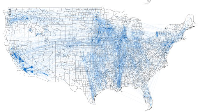
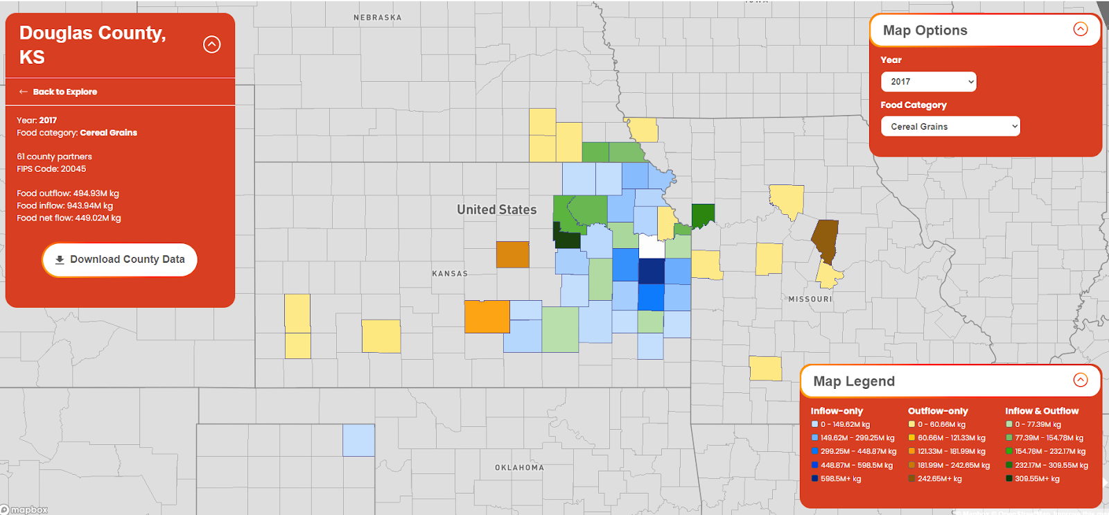
Developed by a team of researchers at the University of Illinois Urbana-Champaign, FoodFlows is the first comprehensive map of the US food supply chain. The interactive visualization system displays the flow of food products between counties - with 9.5 million links on the map. FoodFlows allows you to see the amount and type of food products being sent between the nation’s counties - providing informative insight on where food products are being produced and where they are being sent. FoodFlows is easy to navigate and use, just click on a county and it will display the other counties where it sends its food products and the counties from where it receives its food products, color-coded to indicate quantity. You can even filter for certain types of food products.
FoodFlows was developed by a team of researchers led by Megan Konar - assistant professor of Civil and Environmental Engineering at the University of Illinois. Konar is a scientist whose research focuses on the study of water and how it relates to the environment and the economy. Her interdisciplinary research across hydrology, economics, and environmental science serves to inform government policy on issues regarding agriculture and urban planning.
The First Interactive Map of the US Food Supply Chain

While most food research focuses on increasing productivity, FoodFlows aims to expand our understanding of food distribution, to increase both efficiency and security in the American food supply chain. The team’s data is based on the CFS or Commodity Flow Survey - conducted every five years by the US Census Bureau and the Bureau of Transportation Statistics. The research was supported by the National Science Foundation for its potential to improve the resilience of the US food supply chain in the face of drought or other catastrophe.
American Food Outflows and Inflows Map
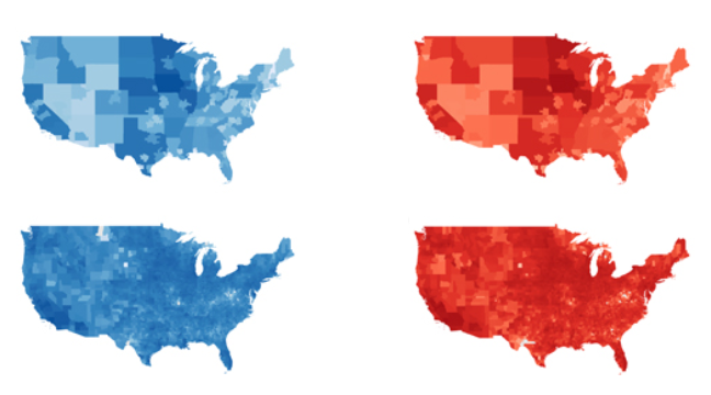
The blue maps on the left represent food outflows, while the red maps on the right represent food inflows.
American Food Outflows and Inflows Bar Graph

In 2012, Los Angeles County exported and imported more kilograms of food product than any other county in America - followed by Fresno County and Stanislaus County. Nine out of the ten counties exporting the most food products were located in California.
The research of Professor Konar and her team provides promising insight into the US food supply chain. Her team is hoping that the information will be utilized in other studies for further research.
Click here to see a visualization of where your county gets and sends its food products using FoodFlow.